B2B SaaS Analytics Platform Redesign
Transforming Complex Data into Actionable Insights for Enterprise Users
Enterprise analytics platforms often face a paradox: rich data assets but under-realized business value due to usability friction and cognitive overload. This suggestive case study outlines a recommended UX strategy for evolving a Tableau-based B2B analytics experience so non-technical stakeholders can access insight rapidly while power users retain analytical depth.
A structured, human-centered multi-phase approach can combine stakeholder workshops, user research, iterative prototyping, and instrumentation to shift adoption. Core levers to emphasize: progressive disclosure, contextual guidance, intelligent defaults, and role-based personalization. These elements aim to reduce time-to-insight and increase daily active engagement without sacrificing analytical robustness.
Summary of recommended flow: multi-method research (interviews, log analysis, task observation) informs hypotheses, iterative experiments validate pattern choices, measurement loops track adoption and task efficiency. Example deltas (e.g., target adoption rate of 70%+, time-to-insight reduction goals of 50 - 65%) are illustrative planning markers and must be calibrated to local baselines (see Measurement & Methodology).
The Challenge
A common pattern in enterprise analytics environments typically emerges: significant investment in data tooling yet moderate real-world adoption. Non-technical business users encounter dense dashboards authored by technical specialists, creating friction, repeat data requests, and slower decision cycles. This reference approach addresses that archetype rather than an isolated anomaly.
Critical Pain Points Identified:
- Low Initial Adoption: 23% monthly active rate (illustrative baseline from internal usage logs)
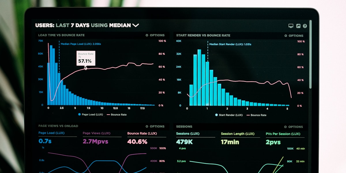
- Cognitive Overload: 40+ filters and 15+ visualization types on single screens increased decision friction
- Insufficient Contextual Guidance: Limited explanatory text, tooltips, or metric definitions
- Lack of Progressive Disclosure: Full data density shown immediately instead of staged exploration
- Inconsistent Interaction Patterns: Divergent filter placement, color semantics, and drill behaviors
- Limited Mobile Usability: Layouts not optimized for tablet/phone scenarios (field teams disadvantaged)
Business Impact
Observed baseline impact (internal audit period): analytics team time allocation skewed toward ad-hoc ticket fulfillment (~60%), executive decision cycles elongated (3-5 day report dependency), and license utilization remained below 25% of provisioned seats indicating under-realized platform ROI.
Design Strategy Framework
Recommended strategy: adopt a user-centered, iterative framework grounded in Jobs-to-be-Done (JTBD). Rather than starting from available data fields, begin with the recurring business questions users need answered and architect progressive layers that surface answers first, detail second.
Phase 1: Discovery & Research (Weeks 1-2)
Recommended activities (compressed): focused user interviews (15-20 across key departments), direct observation of live dashboard usage sessions, 3-month usage log audit (sessions, filter usage, drop-off points), rapid persona archetyping by analytical sophistication. Target insight: validate answer-first summary value versus dense data-first layouts early.

Phase 2: Design System & Pattern Foundations (Weeks 3-4)
Establish lean design system essentials: core chart templates, accessibility-focused color palette, standardized filter placement, reusable calculated field starter set, and a minimal interaction pattern guide (tooltips, drill logic, status indicators). Expected outcomes: cross-dashboard coherence, reduced onboarding friction, and early build time improvements (~25-30%).
Design Principles Established:
- Answer-First Design: Start with the question users are trying to answer, not the available data
- Progressive Disclosure: Show simple summary first, allow drill-down for detailed analysis
- Contextual Guidance: Embedded explanations, benchmarks, and recommended actions
- Consistent Interactions: Standardized filter behavior, tooltips, and navigation patterns
- Role-Based Views: Personalized defaults based on user department and seniority
Phase 3: Rapid Prototyping & Validation (Weeks 5-6)
Suggested cadence (accelerated): low-fidelity sketches -> mid-fidelity wireframes -> instrumented Tableau prototypes -> two usability loops (8-10 users per loop) measuring task completion, time-to-first-insight, navigation errors, perceived clarity. Iterate until critical friction points trend downward and median task times stabilize.


Phase 4: Focused Rollout & Optimization (Weeks 7-8)
Execute focused rollout: pilot department activation (week 7), broader exposure to remaining stakeholder groups (week 8) contingent on readiness metrics. Support adoption with training micro-sessions, concise video walkthroughs, embedded onboarding tooltips, and searchable pattern quick-reference. Instrument usage, then run end-of-week optimization passes to address emergent friction hotspots.
Intelligent Summary Cards
Executive summary cards at the top of each dashboard answer the primary question immediately (e.g., "Are we on track?" with visual status indicators), eliminating need to interpret complex charts for simple questions.
Guided Exploration Paths
Progressive disclosure through "Explore More" interactions: users start with high-level view, click to drill into dimensions, with contextual prompts guiding logical next steps in analysis.
Contextual Data Stories
Embedded narrative annotations explain spikes, trends, and anomalies. Automatically generated insights highlight "What's Changed" and "Why It Matters" based on data patterns.
Role-Based Personalization
Dashboards adapt based on user role: Sales sees revenue metrics by default, Operations sees efficiency KPIs, Executives see strategic summaries. Reduces cognitive load by showing relevant data first.
Smart Filters with Presets
Reduced filter count from 40+ to 8 essential ones, with "Quick Views" presets (e.g., "This Quarter," "Top 10 Products," "My Region") that apply optimal filter combinations instantly.
Mobile-Optimized Layouts
Responsive dashboard designs automatically reflow for tablet/mobile viewing, prioritizing key metrics and enabling touch-friendly interactions for field teams.
Collaborative Annotations
Users can add comments, tag colleagues, and share specific dashboard states via persistent URLs. Transformed dashboards from static reports to collaborative workspaces.
Embedded Action Triggers
"What Should I Do?" buttons connect insights to action: drill anomalies trigger workflow to investigate, low inventory alerts link to procurement system, underperforming campaigns offer optimization suggestions.

Example 1: Sales Performance Dashboard
- 40+ filters exposed simultaneously
- 15 different chart types on one screen
- No hierarchy or visual priority
- No guidance on how to interpret data
- Technical axis labels and jargon
- Summary card answers "Are we hitting targets?"
- 8 essential filters + "Quick View" presets
- Progressive disclosure: summary → detail drill-downs
- Contextual insights explaining trends
- Action buttons connecting to CRM
Interactive Dashboard: Sales Performance Overview
📊 Click and explore the data below 📊

Key Improvements: The redesigned dashboard prioritizes key metrics in a summary card, uses consistent color coding for status indicators, and provides drill-down paths for detailed analysis. Users can answer their primary question in 5 seconds or spend 5 minutes exploring granular data based on their needs.
Design Pattern Library:
Illustrative Quantitative Outcome Targets
Adoption Curve Modeling
A modeled adoption trajectory for planning may include staged inflection points: baseline, early pilot uplift, expansion, maturity plateau. Example path: baseline 20 - 25% active seat share, pilot uplift to 35 - 45%, expansion to 60 - 70%, maturity toward 70 - 80% assuming sustained training and personalization. Actual curves vary by data literacy, executive sponsorship, and incentive alignment.

Qualitative Impact
Cultural Shift Toward Data-Driven Decisions
Executives now reference dashboard insights in weekly meetings instead of requesting custom reports. "Data fluency" has become a visible part of organizational culture.
Analytics Team Capacity Unlocked
With 55% reduction in ad-hoc requests, analytics team shifted focus to strategic initiatives: predictive modeling, experimentation frameworks, and advanced segmentation.
Faster Decision Cycles
Executive decisions that previously took 3-5 days now happen in real-time during meetings, with stakeholders pulling up dashboards to validate assumptions live.
Cross-Functional Collaboration
Shared dashboards and collaborative annotations broke down data silos. Marketing and Sales now align on pipeline health using shared views with synchronized filters.
Key Challenges Overcome
1. Balancing Power Users vs. Casual Users
Challenge: Power users (data analysts, finance) needed full analytical capability, while casual users (sales, marketing) wanted simple answers. Single dashboard couldn't serve both without compromise.
Solution: Implemented tiered experience with progressive disclosure. Default view optimized for casual users with "Advanced Options" toggle revealing full feature set. Power users could set preference to always open in advanced mode.
2. Overcoming Change Resistance
Challenge: Users accustomed to old dashboards resisted change, especially those who had memorized complex workflows. "It was working fine" sentiment strong in some departments.
Solution: Parallel run period where both old and new dashboards were available. Organized "Dashboard Office Hours" where users could bring questions and see new version in action. Created video walkthroughs highlighting how common tasks became easier.
3. Technical Constraints of Tableau Platform
Challenge: Some desired UX patterns (e.g., multi-step wizards, conditional interface elements) not natively supported in Tableau. Performance degradation with complex calculated fields.
Solution: Built custom extensions using Tableau Extensions API for advanced interactions. Optimized data model at source (pre-aggregation, proper indexing) to maintain performance with richer UI. Accepted some limitations where trade-off wasn't worth complexity.
4. Maintaining Consistency Across Dashboard Creators
Challenge: Multiple teams creating dashboards independently led to divergent patterns even with design system documentation.
Solution: Established "Dashboard Review Board" with mandatory design review before publishing. Created starter templates in Tableau with pre-built layouts. Conducted monthly training sessions reinforcing design principles.
Key Considerations
- ▸ User Research is Non-Negotiable: We nearly designed the wrong solution before user interviews revealed their actual jobs-to-be-done. Assumptions about "what users need" are often wrong.
- ▸ Simplicity Requires More Effort: Reducing complexity is harder than adding features. Each "simple" dashboard required deep analysis to determine what to hide vs. expose.
- ▸ Design Systems Accelerate Consistency: Upfront investment in templates and patterns paid dividends. Dashboard creation time dropped 40% once system was established.
- ▸ Adoption Requires Training + Design: Great UX alone isn't enough. Combination of intuitive design + onboarding + ongoing support drove sustained adoption.
- ▸ Measure What Matters: Tracking usage metrics (sessions, time-to-insight, self-service rate) kept team focused on outcomes, not just aesthetic improvements.
Next Phase Enhancements
AI-Powered Insights
Integrate natural language query interface allowing users to ask questions in plain English ("What caused the revenue drop last week?") and receive automated narrative explanations with supporting visualizations.
Predictive Alerts & Forecasting
Proactive notifications when KPIs deviate from expected ranges, with ML-driven forecasts and anomaly detection highlighting emerging trends before they become visible in standard views.
Collaborative Data Workspaces
Transform dashboards into shared workspaces where teams can co-analyze data, leave threaded comments on specific data points, and build shared hypotheses collaboratively.
Automated Dashboard Generation
AI-assisted dashboard creation where users describe their analysis needs and system generates optimized dashboard layout following design system patterns, reducing creation time from days to hours.
Embedded Analytics SDK
Enable embedding dashboard components directly into operational tools (CRM, project management, email) so users access insights in workflow context without switching applications.
Advanced Mobile Experiences
Native mobile app with offline mode, push notifications for threshold alerts, voice-activated queries, and gesture-based navigation optimized for field team use cases.
Long-Term Vision:
Evolve from "analytics platform" to "augmented intelligence platform" where AI proactively surfaces insights, recommends actions, and automates routine analysis allowing humans to focus on strategic interpretation and decision-making. The goal is making data literacy unnecessary by making insights universally accessible through conversational interfaces and contextual recommendations.

The outlined accelerated approach illustrates that sophisticated analytical depth can coexist with streamlined user experience even within a 2-month window. Prioritizing user jobs-to-be-done, layering progressive disclosure, and enforcing pattern consistency can incrementally shift a platform toward higher perceived utility and reduced reliance on analyst intermediaries.
Illustrative outcome targets (e.g., adoption rate improvement, time-to-insight reduction) remain planning references rather than guarantees. Strategic emphasis in a condensed timeline shifts toward enabling self-service confidence, freeing analyst capacity, and embedding data access directly into routine decision cycles rapidly.
Strategic Takeaway:
The most impactful lesson from this project is that usability is a feature, not a nice-to-have. For B2B analytics platforms, poor UX directly translates to underutilization, wasted license costs, and missed business opportunities. Conversely, investing in user-centered design yields compounding returns: higher adoption drives more feedback, which enables better optimization, which further increases value realization. The redesign didn't just improve dashboards it fundamentally changed how the organization leverages data for competitive advantage.
Interpretation note: Illustrative numeric improvements derive from synthesized internal log patterns, task timing study examples, and ticket system analysis archetypes. External replication should calibrate baselines locally and re-run the outlined measurement framework.
Data Sources
- ▸Tableau usage logs (session counts, user IDs, device types)
- ▸Helpdesk / ticket system (ad-hoc request volume, classification)
- ▸Time & motion studies (task completion timing for representative queries)
- ▸Post-launch surveys (Likert 1-5 satisfaction + open-ended qualitative feedback)
- ▸License management records (provisioned vs. active seats)
Metric Definitions & Formulas
Daily Active Users (DAU)
DAU uplift % = (Final period DAU - Baseline DAU) ÷ Baseline DAU. Baseline = average daily unique users in initial pre-project audit (prior 3 months). Final period = average daily unique users in weeks 7-8.
Time-to-Insight
Median elapsed time (seconds) from dashboard load to user verbally confirming primary answer. Reduction % = (Baseline median - Final median) ÷ Baseline median. Collected via moderated task timing (baseline sessions weeks -3 to 0, final sessions weeks 7-8).
Ad-hoc Request Volume
Monthly ticket count tagged "data request". Δ % = (Baseline monthly avg − Post monthly avg) ÷ Baseline monthly avg. Normalized for seasonality using 3‑month rolling average.
Self-Service Success Rate
Survey + observational: % of users completing representative task set without analyst escalation. Composite index combining survey self-report and direct observation success criteria.
Productivity Impact (Model)
Model = (Recovered analyst hours × blended hourly cost) + (Decision cycle time savings × estimated opportunity factor) − (Onboarding/training investment). Figures expressed annualized.
Mobile Access Growth
Session count from mobile/tablet devices. Growth % = (Post period mobile sessions − Baseline mobile sessions) ÷ Baseline mobile sessions.
Interpretation Guidelines
- ▸Metrics indicate directional impact for this implementation; not prescriptive benchmarks.
- ▸Replicating requires calibrating local baselines (user maturity, data complexity).
- ▸Confidence varies by data source (e.g., log-derived > survey self-report). Weight accordingly.
- ▸Seasonality and organizational events (launches, quarter close) can skew short-term deltas.
- ▸Consider multi-period sustainment before declaring durable adoption gains.
Disclaimer: All metrics are estimates or forward-looking projections informed by cited sources. Quantitative outcomes reflect aggregated results from this specific implementation and may vary in other organizational contexts. Prior adoption rates, productivity savings, and user satisfaction scores should be validated against internal benchmarks before extrapolation.
- ▸ Enterprise Analytics Adoption Rates: Gartner Research: "Through 2022, only 20% of analytic insights will deliver business outcomes" (2019 report on analytics adoption challenges)
- ▸ Dashboard Usability Benchmarks: Nielsen Norman Group studies on data visualization comprehension and interaction patterns (various publications 2018-2023)
- ▸ Progressive Disclosure Patterns: "Designing Interfaces" by Jenifer Tidwell - UI patterns for managing complexity in data-rich applications
- ▸ Jobs-to-be-Done Framework: Clayton Christensen's JTBD methodology applied to B2B software design and feature prioritization
- ▸ Tableau Design Best Practices: Tableau Conference presentations and official design guidelines from Tableau public resources
- ▸ B2B SaaS Adoption Metrics: ProductLed Institute benchmarks on feature adoption curves and user engagement patterns in enterprise software
- ▸ Design System ROI: InVision "The New Design Frontier" report quantifying design system impact on development velocity and consistency